

Lighting Art with Museum Expertise
If you show up early at the sneak-peak press preview for a big museum exhibition, you may spy an exasperated lighting tech just barely finishing the lights and scurrying out of the galleries on a scissor lift at the last minute. The plight of this museum worker is understood among their peers and symptomatic of a commonly overlooked, yet crucial, final step in showing artwork: the Lighting! For good reason, a great deal of planning and energy goes into preparing, handling, and installing an art collection, whether at a museum or residence, which can give the impression that an artwork is primarily an object. It’s important to remember, however, that art is meant to communed with visually, and good lighting helps us do that best.
Properly lighting artwork reinforces the value of having it in the first place—we want to see what we love about a piece every time, and to share that with others. With good lighting, colors pop, portrait’s eyes peer back, and minute variations in shade and hue better define shape and depth. From afar, good lighting gives art distinction from the rest of the room and a better chance at alluring attention. Perhaps most importantly, it does justice to the artist who made a million decisions to make a piece, and who would want the fruits of each see the light of day.
So how do you properly illuminate artwork? This largely depends on the particulars of the artwork and its location, and below we’ll cover some strategies based on size and materials. But before you can light art, it is necessary to find the right equipment, starting with the light source.
The Light Source
Finding the right light source for your project is key to successfully lighting your artwork. On the surface of things, lamps seem to be pretty simple objects that we buy for certain applications and don’t give much thought to their specifications; as long as they do their job, right? As the element that allows visual art to be understood and appreciated, it pays to invest a little thought and research in the light sources you’ll use. Knowing these five characteristics—type, color quality (CRI), color temperature, beam angle, and luminosity—will help you identify the best products to work with your design.
Light Types
LEDs are becoming the universal standard for functional lighting all over the globe, and major advances have been made toward improving their quality, so it is probably a good idea to work with them. Since LEDs can be a little expensive compared with conventional lamps, it’s tempting to find cheaper products. Spending a little more on brands that cater to the museum industry, such as Soraa and Cree, will guarantee longer life and consistent performance. As far as other light sources are concerned, Incandescent and halogen bulbs produce good and consistent color, better than many LEDs, but they generate a good deal of heat that can be harmful if placed too close to an object, plus they are not particularly energy efficient and largely being phased out of production. Fluorescent lights generally deliver poor color and can emit too much UV radiation, so generally a no go. If there is no option other than a fixture meant for fluorescent tubes—in an office hallway, for example—look for quality retrofit LED tubes built to fit in those fixtures.
Color Quality (CRI)
While most consumer interior lights purport to be white, they will not all handle color the same way. If you think back to high-school science, you’ll remember that white light is made up of a spectrum of colors—think the rainbow—and the color of an object is produced by it absorbing some of the spectrum and reflecting the rest back for us to see. If you are looking at a brilliant purple, it’s because the light you’re seeing it with contains that purple in the first place. Some LED and fluorescent products don’t cast the full spectrum of light and instead emulate white by casting a limited mix of colors. This might be fine for most applications, but for art with rich color and subtle variations, the result is a loss of vibrancy and nuance. This problem is called poor color fidelity. To help identify products with good color fidelity, a test was developed to give us the Color Rendering Index score (CRI). It analyzes a standard palette of fifteen colors under the light of a certain product and scores it according to how close those colors are to being true, with 100 being perfect. Look for products with a CRI of at least 90 for your artwork. If a manufacturer doesn’t make this score available, it might not be worth using.

Color Temperature
Color temperature describes whether white light is warmer or cooler, and it has bearing both on the way art looks under the light and how light will affect a whole room. Measured in the temperature scale Kelvin (K), this designation is related to the thermal radiation of incandescent lights, where small metal filaments are heated until they glow; the temperature of the metal corelates with the color of the light. The lower the temperature, the more yellow, conversely referred to as warmer. Higher temperature makes them bluer, or cooler. Our eyes recognize the light as white from around 1700K (2600°F) to well past 10000K (for reference, the surface of the sun and its direct light is about 5800K).
Factors for choosing color temperature can be the tone of the artwork, the color temperature of existing lights nearby, or simply personal aesthetic preference. A warmer temperature of 2700K is good for accentuating warm tones and it feels easier on the eye to some, cooler light at 3000K feels a little sharper and helps accentuate blues, greens, and high contrast. Since our brain calibrates to read these lights as white, it’s good to try for consistency by sticking with the same temperature—lamps with alternating temperatures appear to clash with one another.

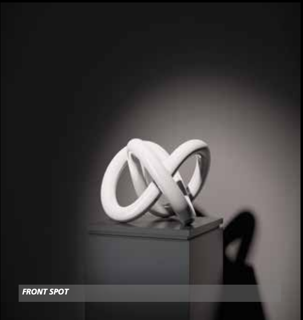
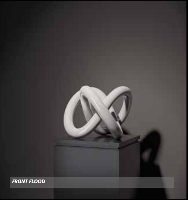
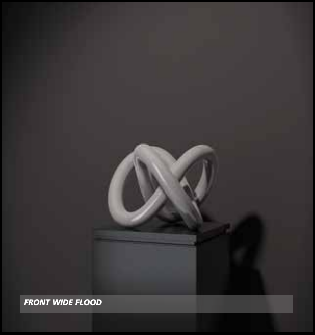
Beam Angle and Luminosity
Unlike the omnidirectional light of the classic round light bulb, the best lights for strategically lighting artwork will be unidirectional lamps, which can be pointed at and focused on the work when used with the appropriate adjustable fixtures. This type of lamp always has a beam angle that describes the shape and coverage of the emitted light, ranging from narrow spots to wide floods. Which you use depends on the overall lighting design and interplay of lights, discussed next, but there are a few common situations. Spotlights under 20° can be used for small pieces and 3D objects shown in the round, regular flood lights between 20° and 35° are good for middle and larger framed works, and wide flood lights over 35° are best for lighting very large works and whole walls.
Beam angle’s influence on brightness is important to understand for maintaining relatively equal brightness across a light installation. A lamp’s luminosity tells you how bright it is, but that can be deceiving because that measurement, in lumens, tells us absolute output coming directly out of the lamp, not what it looks like on an object. Whatever fixed number of lumens produced by a lamp is spread out by both the beam angle and distance the light travels, so lamps with the same luminosity but different beam angles will not appear equally bright—wider floods appear dimmer than spots. Keep that in mind during your search and get brighter floods and dimmer spots.
Putting Lights up and Lighting the Art
Adjustable track lighting, the ideal situation…
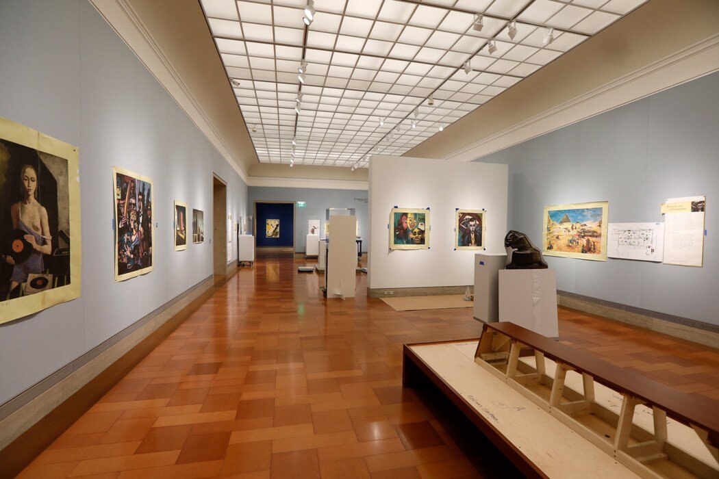
If you are working in a gallery space or can add lighting according to the locations of your artwork, track lighting with interchangeable fixtures that can be focused in any direction will give you the most flexibility for achieving ideal illumination. There are all sorts of slim and handsome track lighting systems on the market, and one can likely be found to meet your aesthetic and/or budgeting needs. The tracks should be parallel to the walls on which art will be hung and nearly as long. The distance tracks are installed from the install wall should be enough to avoid raking the art—that is shining light from a very sharp angle close to the picture plane—yet close enough to pass over the average viewer’s head; an angle of 30°- 40° from the wall should work.

Light and track placement about 30°- 40° from the wall lights the work evenly while avoiding bouncing glare and shadows of viewers heads.
Lighting the Art:
Knowing your overall design of a room or gallery is always the first step to lighting the artwork; this is where you set the mood and choose the kind of lamps and fixtures you’ll use. There are typically two extremes of mood found in museums and galleries: contemporary and dramatic. Both offer lessons for lighting artwork in any situation, and most installations fall somewhere in the middle.
‘Contemporary’ lighting is marked by complete and even washes of cool light throughout the installation space and is typically used for Modern and contemporary art. There are two ways to achieve this. One is to use very wide floods as wall washers at regular intervals to evenly light every inch of wall. The other, if one is really committed to this look, is to install LED tube lighting (instead of fluorescent), in long lines along the perimeter of the space. Contemporary style has little variation in lamp type and needs little maintenance as it tends to be a one-size-fits-all strategy.
Dramatic lighting involves putting tight spots of light over the artwork in a dark room—think Caravaggio as interior designer—and tends to be found with antiquities and old masters. Spotlights and regular floods tightly focused on the art will do nearly all the work lighting the room, and warmer color temperatures tend to look better. If there is not enough light bounce from these spots to make the room navigable, dim wide floods can be used to bring up walls and floors to balance out the room. This mood requires a reevaluation of the lighting every time a piece is moved, so is both labor and lamp intensive.

The middle approach tends to be the most practical and easy on the eyes. The room should first be lit evenly and look comfortable on its own using wide floods at regular intervals. Then spots and regular floods come in to bring up the levels on just the artwork, creating subtle highlights on the pieces. This strategy means moving artwork doesn’t disrupt the whole lighting plan and pieces still get a nice alluring bump of brightness. The color temperature can be tailored to the colors in the artwork, furniture, paint, or just plain preference, but should remain constant across the different lamps.
Whether you are creating subtle highlights or dramatic illumination, how you go about lighting an artwork can make a big difference by both highlighting features and hiding defects. The shape, size, texture, and material of a piece will tell you how to light it, and here are some strategies to begin with.
Works on Paper
It’s important to remember that not all flat art is truly flat. Works on paper, be they prints, drawings, or photos, tend to have little important surface texture, but sometimes there are undesirable wrinkles, creases, and bows. It’s best to light works on paper relatively straight on, or at a right angle from the wall. Direct light has a flattening effect, so any flaws won’t stand out. However, sometimes lighting larger glazed pieces from the center creates a distracting reflection in the glass. Splitting the light source, described next, can solve that.
Paintings
Larger paintings and those with heavy impasto benefit from angled light coming from both sides. For the example of a five-foot-wide painting, take two regular flood lights, spread them each about a foot outside the edges of the canvas, and focus them on their opposite portion of the picture (right light points to left part of painting, and vice versa). The uneven surface catches the angled light and makes a subtle mix of highlights and shadow that accentuates the texture and activates the surface, all while looking evenly lit.

For large and textured paintings, cross lighting works well to accentuate surface detail and give even coverage.
Very Small Works:
Very small works and books beckon the viewer to look closely, which introduces their head as a major obstruction to good lighting. Regardless of the material or texture, your strategy will be to get around the viewer. With track lighting behind the viewer, you may be forced to aim over the viewer’s shoulder with narrow spotlights at sharp angles to the wall, much like the strategy for lighting paintings but with raking light on a smaller target.
Sculptures
The possibilities of shape and size of 3D art make a standard lighting solution impossible, but here are a few tips. Consider how one might approach the artwork and establish front from back, then light the front from over the viewer’s shoulders. Avoid putting lights in the eyes of people walking into the room or looking at the piece—entering a room and looking into a beam of light can be disorienting and unpleasant. If ambient light does well enough at evenly lighting a piece, then a modest spotlight from directly above can add some interesting highlights and activate the surface—this is particularly effective with busts, vases, and anything with lots of surface detail.
Trust Your Eye
Truthfully, a comprehensive guide for lighting artwork can’t really exist. There are simply too many physical and technical variables playing into what is ultimately an aesthetic situation. It helps to understand the technical characteristics of your tools and have a few strategies in your pocket to begin with, but it comes down to what looks good to you in the long run. Try to start with the big picture by establishing what the mood and focus of a room will be, gather the lamps and fixtures you think you’ll need to achieve that, and then work out the details for each piece by looking generously and coaxing all the best parts of the art into the light. This will help you achieve a balanced room with well-lit artwork to be enjoyed fully without deficit or distraction.